By Molly McSweyn and Katie Dunn |
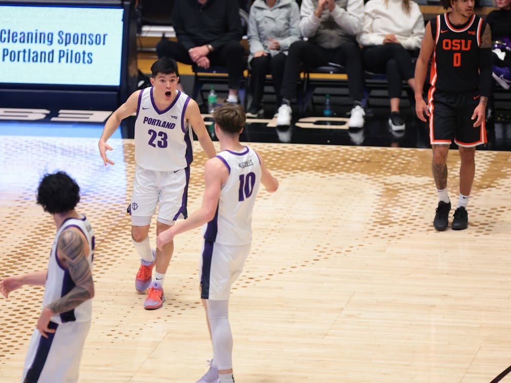
Pilot fans wore all black during Friday’s women’s soccer game to usher in the reveal of the new secondary logo. Athletes also rushed onto the field in their new black apparel, flashing the new logo, an anchor surrounded by a ship wheel, on their shorts.
Freshman soccer player Madeline Dieker said she was happily surprised by the new logo.
“The jerseys are sick!” Dieker said. “They told us they were revealing a new color to the fans, so we came into the locker room before game time, and seeing everything, we were so psyched and pumped.”
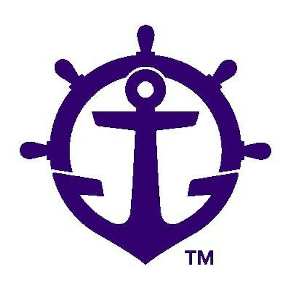
The Pilots brought back the historic wheel for a new secondary logo, which was designed by the NIKE Graphic Identity Group. Karina Handeland, associate athletic director for external relations, said they wanted to return to the nautical roots of the Pilots.
“What we looked at was what can we change, what can we clean up with those marks and, if anything, what are we missing in our full line of marks,” Handeland said. “What we found is we really needed that personality tertiary mark to bring back the riverboat pilots, to make it a nautical feel.”
This secondary logo will be used on specialized uniforms, apparel for fans and other projects according to a press release from athletics.
“The top part is the wheel, the bottom part is the anchor, and we didn't want one or the other. We wanted them to be combined and pull that story together as the University,” Handeland said. “That ties in not just athletics on its own, but athletics and the university.”
The secondary logo has gotten mixed feedback from the students so far.
“Its a really cool logo,” said senior Villa Drum Squad leader Connor Snashall. “I love that they brought back something old, redid it and made something new.”
However, some students, including senior basketball player Jasmine Johnson, are less enthused with the new logo.
“I think it's kind of too much going on,” Johnson said. “If they had just had the wheel it would have been perfect but putting the anchor in it just looks silly, to be honest.”
The Pilot ‘P,’ which has come to represent UP athletics since it was created by NIKE in 2006, received some rejuvenation as well. Black, silver and grey were added as secondary colors and there was an overhaul of the brand style guide.
"On the two-color version of the P, the line on the right side was also made thinner. This accentuates the center line of the P, which represents the Willamette river running between the The Bluff and the city of Portland." Handeland said.
Athletic Director Scott Leykam said athletics is excited to move forward with the brand refresh.
"We heard a lot from our long-time fans that they had an affinity for the old concept with the anchor and the wheel," Leykam said in a press release. "We did a lot of background research dating back to the early 1900's and NIKE really ran with the concept and created a great secondary logo for our use. It will complement our brand well."